Dexcom G6

The Problem
For the Dexcom G6 project, I was given a clear problem to address; improve the app’s searchability so users could quickly find answers to frequently asked questions and product information. The existing experience made it difficult for users to locate the details they needed, leading to frustration and inefficiency. My goal was to streamline this process, ensuring that users could access key information faster and with less effort.
To address this, I focused on three primary user search goals. First, users needed an easy way to find information about other Dexcom apps that connect to the G6 system. Second, they needed a reliable way to troubleshoot product issues without having to dig through multiple menus or external resources. And third, the app needed to seamlessly integrate FAQ content from the website, reducing the need for users to leave the app to find answers.
With these objectives in mind, I formed a hypothesis: users should be able to locate a specific piece of information within one minute. This became my benchmark for evaluating the success of the redesigned search experience, ensuring that the solution would not only be functional but also efficient.
My Role
In this project, I performed various tasks, taking on the roles of UX/UI designer, user experience researcher, and usability tester. From start to finish, I worked closely with a fellow student as a partner, Tim, ensuring that every stage—from research to design to testing—was aligned with our shared vision. Constant communication was key, allowing us to refine our approach as new insights emerged. My responsibilities spanned several critical areas, including:
- Research and Analysis – First, I conducted a competitive analysis of the Dexcom G6 app and its competitors, identifying strengths, weaknesses, and opportunities to enhance the user experience.
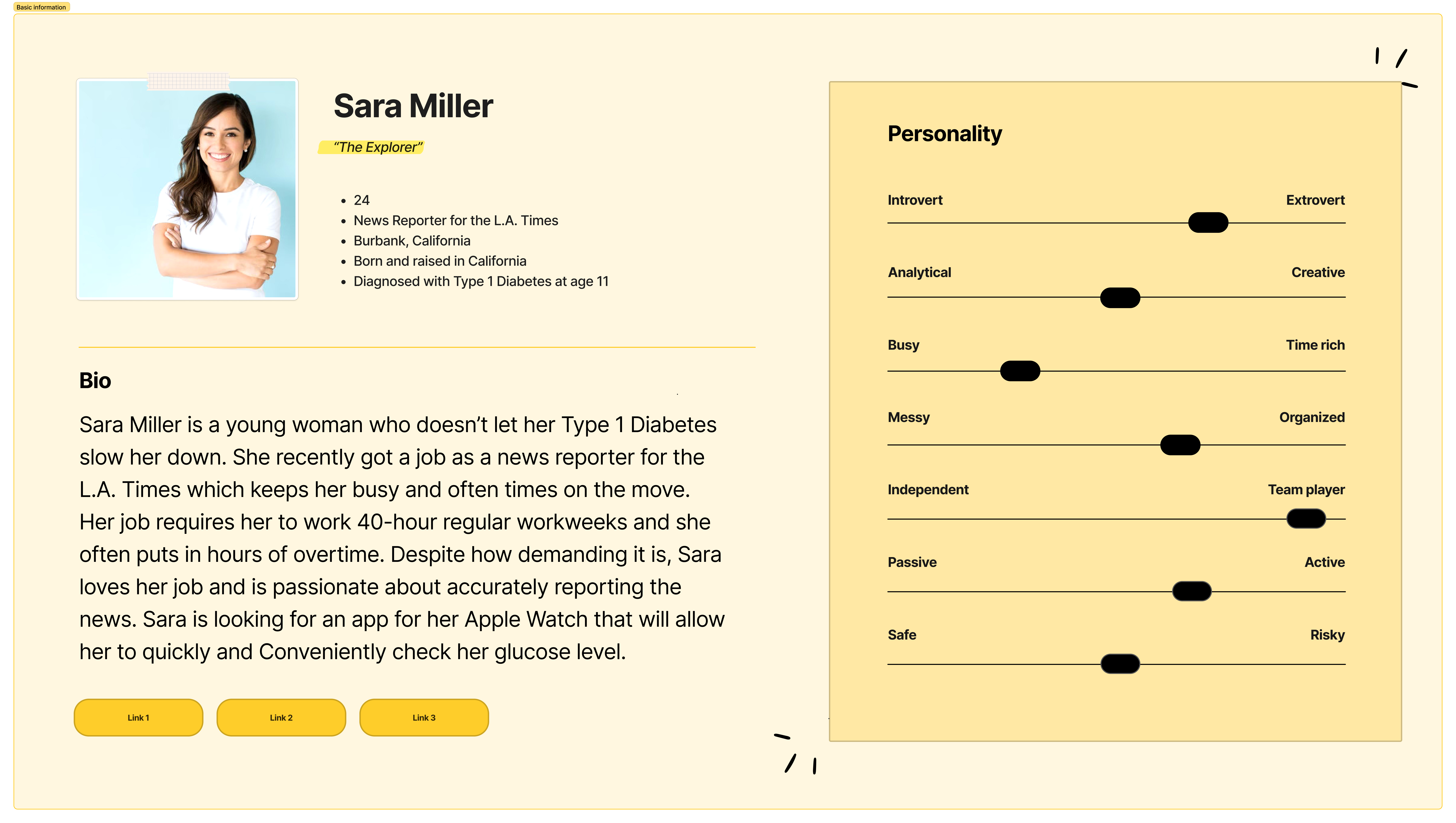
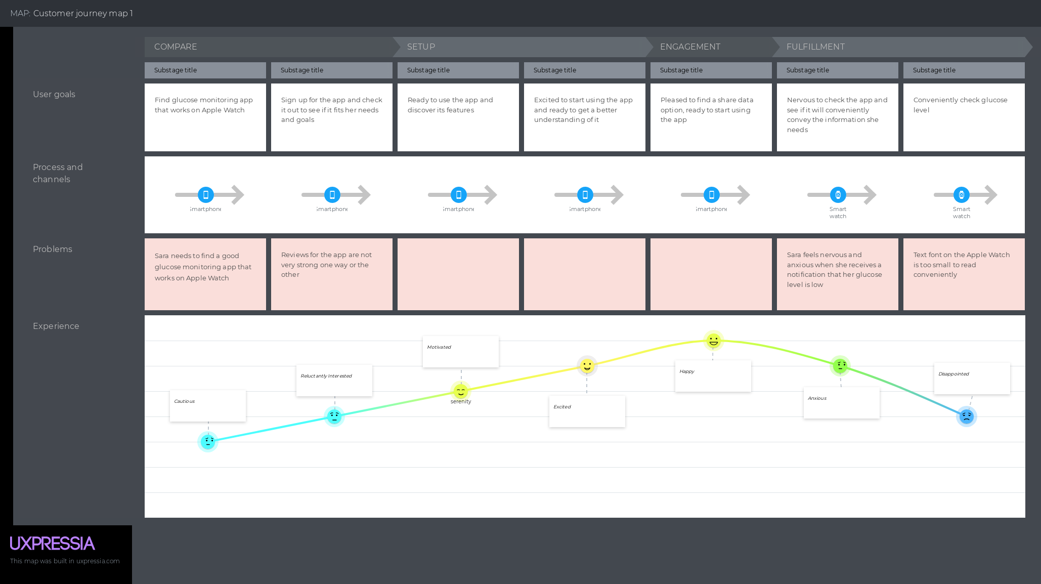
- Personas and Journey Mapping – Second, to build a deeper understanding of our target audience, my partner and I collaborated on developing user personas and journey maps, pinpointing user needs and potential pain points.
- Prototype Design and Development – Next, I moved into prototype design and development, creating an improved search experience that integrated our research findings.
- Usability Testing – Finally, I conducted usability testing with two participants who met specific criteria, validating our hypothesis and uncovering areas for further refinement. Through each stage of the process, our goal remained the same: to create a intuitive search experience that truly met users’ needs.


How the solution came about
The proposed solution emerged through a structured, user-centered design process. It began with in-depth research, where I analyzed the Dexcom G6 app and its competitors to identify pain points and areas for improvement. User personas and journey maps helped clarify the needs and behaviors of our target audience, ensuring our design decisions were rooted in real user experiences.
From there, my partner and I brainstormed potential solutions, focusing on enhancing searchability and efficiency. We explored ways to integrate FAQ content directly into the app, simplify the search interface, and improve navigation. Prototyping allowed us to test these ideas, and by staying focused on user needs and validating our hypothesis through testing, we arrived at a streamlined search experience that made finding information faster and more efficient.
How the solution solved the problem
The proposed solution directly addressed the core problem by making information within the Dexcom G6 app easier to find and access. By integrating FAQ content from the website, users no longer had to leave the app to get answers to common questions. The search feature interface streamlined navigation, ensuring that users could locate troubleshooting steps and product details with minimal effort.
Our usability testing confirmed that the improvements made a measurable impact. Participants were able to find specific pieces of information within the one-minute benchmark we had set, validating our hypothesis. By prioritizing user needs we successfully transformed the app into a more efficient and user-friendly tool.
Challenges Faced
Balancing Simplicity with Functionality – One of the biggest challenges we faced during the project was balancing simplicity with functionality. Our goal was to make the search experience feel seamless and intuitive, but to not be too minimalistic that users would not be able to find what they need.
Budget/Time Constraints – With limited resources and time, we had to prioritize core features for the initial prototype, which meant scaling back on certain ideas. One function that we had considered prototyping was the ability to search using voice controls, but due to a lack of time we decided not to pursue adding this functionality to our prototype.
How the project affected the users and the business
Reduced Time and Effort – For users, the redesigned search experience significantly reduced the time and effort needed to find information. By integrating FAQ content directly into the app and improving the overall usability, we made it easier for users to troubleshoot issues, understand product features, and discover related Dexcom apps without leaving the app or digging through external resources.
What I Learned
Communication is Vital – During this project I learned how critical collaboration and clear communication are when working across multiple roles. Balancing responsibilities as a UX/UI designer, researcher, and tester required staying organized and maintaining an open line of communication with my partner to ensure consistency throughout the project.
Research is Key – This project taught me the importance of grounding design decisions in real user behavior. While it’s easy to make assumptions about what users need or want, conducting thorough research and usability testing revealed insights that reshaped our approach and ultimately led to a more effective solution.