GoodRx Pro

The Problem
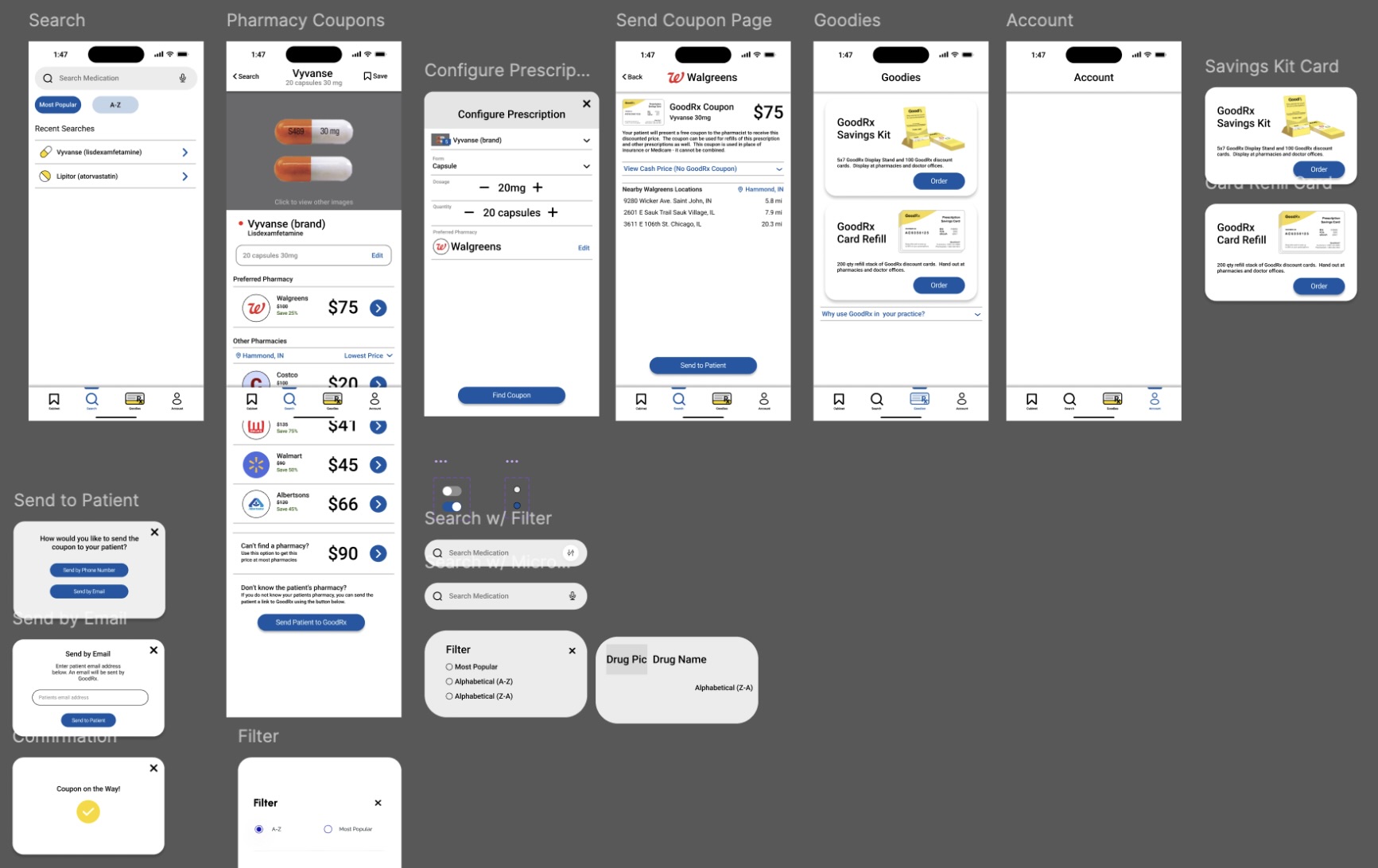
The main problem that the GoodRx Pro app aimed to solve was the high cost of prescription medications. Many people were unaware of cheaper alternatives or had trouble comparing prices across pharmacies, so the app was designed to help doctors easily provide their patients with medication coupons. However, my team's initial assessment found that GoodRx Pro’s interface was not as sleek and up to date as the regular GoodRx app, and it lacked various basic search features, such as filter options, recent search history, and quick access to the most common prescription medications.
My Role
For this project I worked as part of a team with two other teammates, Andrew and Krislyn. I contributed primarily to the user interface (UI) and user experience (UX) design and research. My role involved understanding user needs through research, including analyzing user reviews to learn what pain points users experienced. Andrew was primarily responsible for designing several key screens, such as the search interface and medication pages, Krislyn focused on the medicine cabinet section, and I assisted with the overall layout and helping out where needed.

How the solution came about
To arrive at a solution, we conducted research to understand the pain points related to the app and finding the best priced prescription medications. By looking at reviews of the app left by users we identified that users wanted transparency in pricing and a streamlined process to find cheaper alternatives. From this, we developed an intuitive interface that allowed users to search for medications, compare prices across different pharmacies, and send coupons to patients. Additionally, the application incorporated an educational element on the coupon screen to improve user awareness of how patients will receive and use the coupons sent to them.
How the solution solved the problem
The proposed solution addressed the main issue by providing users with a simple and effective tool to find cheaper medication options. Users could easily search and see price comparisons and locate discounts, which ultimately save their patients money. Our redesign included medication cards for quick access, images of the medications for quicker product identification, and used more brand recognizable colors to reinforce the brand identity. Additionally, we redesigned the core user experience flows to simplify the medication configuration process, and removed the outdated news section of the app.
Challenges Faced
Collaboration with Teammates – One of the biggest challenges I faced during this project was collaborating with a team to develop a cohesive design. Each team member had their own ideas and style of design, so we had to keep in constant contact and compromise in order to effectively develop a successful product. Additionally, we established roles for each team member and what part of the design they were primarily responsible for working on.
Managing Information – Another challenge that the entire team faced was ensuring the app’s user interface was intuitive, and that all of the required and relevant information was displayed in an understandable manner. We had to avoid overwhelming users with too much information while ensuring the core functionalities were easily accessible. At one point in the design process, we had considered updating the news section of the application, but ultimately decided that removing it from the app would be more effective because of how outdated the section was, and how it was not what users went to the app for.
How the project affected the users and the business
Improved Efficiency – We redesigned the app to be more efficient, recognizable, and user-friendly for healthcare professionals. Additionally, by aligning the interface with the familiar design language of the consumer-focused GoodRx app, doctors will find the navigation more intuitive and experience less friction during use. These improvements enhance task efficiency and reinforce brand trust and identity among users.
Brand Recognition – Our redesign of the GoodRx Pro app incorporated the colors and design language that are present in the consumer-focused GoodRx app. This redesign aimed to reinforce the brand identity, and make the app feel more inline with what users of GoodRx products expect from them.
What I Learned
Simplicity – Through this project, I learned the importance of simplifying complex information for users and prioritizing their needs throughout the design process. When dealing with an app that tackles prescription medication prices there is bound to be a huge amount of information that needs to be conveyed, so it is important to be able to simplify the process of finding information as much as possible.
Communication is Key – Working with a team to collaborate on this project taught me more about how to effectively communicate with team members to properly execute the design process. I also learned that sometimes compromises are needed to keep the project on track and to make sure all team members feel heard and motivated to work together.